I found it easier to use than when I last tried on sisi but sadly there are still very limited options on clothing and hair styles and a complete lack of any tattoos, piercings or weird futuristic accessories. Of course, right now we just need the portrait and the rest of the body has little meaning. Fingers crossed that more options for personalising ourselves will become part of the game when Incarna lands.
I noticed that there are less interesting options for “posing” on the final screen in comparison to what I saw on sisi, and the interface is still a little bit frustrating in places. In particular the final screen, where you create your in-game portrait, needs a bit more instruction that what it currently has.
You are presented with 4 slots to fill with a “photo” but only the one you actually have high-lighted when you proceed past this final screen will be seen in game. There are sometimes odd graphical differences between how the picture looks when it is smaller and also the characters blink so you have to time your photo accordingly.
Be warned, there is no “are you sure” pop-up and once you have finished there is no going back. Many players are complaining that they are stuck with a portrait they didn't want.
Bearing these points in mind, the new portrait creator is a lot of fun to play around with and there are some fantastic results. I was also surprised at how “different” everyone looks in-game and I spent most of last night just looking at peoples new portraits on the forums and in my various chat channels.
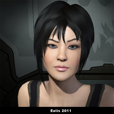
Here is the new Eelis Kiy:

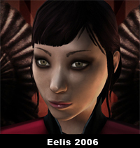
And the old one to compare with:

Not quite what I drafted on sisi but I am very happy with the results. What you cannot see from this picture are her child-bearing hips and rather bootytastic derriere. I wonder if we will get hawtpants with Incarna so I can relive my SWG glory days… hmm.
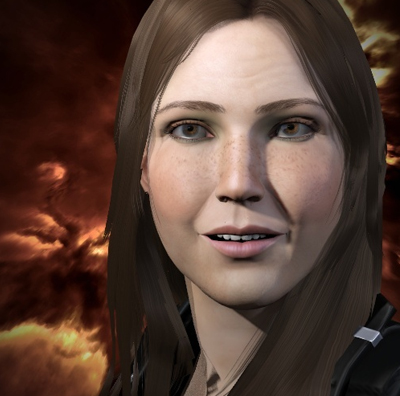
Also, here is my alt, who looks nothing like her original picture but now bears a rather striking resemblance to yours truly. Complete with freckles and the odd wrinkle *cry*

Finally. If anyone would like to know how to access a larger picture of their new portrait. Use the steps shown in the last part of this dev blog to obtain the url path and your character ID. Once you have your unique url path just change the number “256” to the number “512”.
Here like this one…
Small - https://image.eveonline.com/Character/868327720_256.jpg
Large - https://image.eveonline.com/Character/868327720_512.jpg
Doesn't seem to work for larger sizes though (i.e. 1024). If anyone knows how to get an even larger version let me know!

Nice!
ReplyDeleteApparently, extra options ARE being added later. Relevant devpost here: http://www.eveonline.com/ingameboard.asp?a=topic&threadID=1443829&page=5#135
They both look very cute Eeelis :D
ReplyDeletehttps://image.eveonline.com/Character/132970041_512.jpg
ReplyDeleteThere's the new Kala. At first, I wasn't sure I liked it, but she's really growing on me :) I reckon I'll keep her just as she is
Cheers all. Nice pic Kalaratiri! Eelis' grew on me a lot also.
ReplyDeleteFurther to whats above, 1.1.1 goes out today and includes a chance to remake the portrait hehe!
http://www.eveonline.com/updates/patchnotes.asp?patchlogID=217